
It is hard to believe that six months have already passed since my arrival to Kathmandu. My volunteering time at OLE Nepal is up. At the end of May, I delivered a final presentation about XOvis, an XO usage visualization application our Data Quest Team has developed, and bid farewell to my Nepali colleagues.
From my previous posts on the blog, some of you might remember that contributing to XOvis project has been my primary focus during my engagement at OLE. While more than three million OLPC XO laptops have been deployed all over the world, the OLPC community has not done much analysis about how learners have been using these laptops beyond gathering anecdotal stories from students, teachers, parents, and school administrators. Identifying a need to learn more about the reality of XO use, a team of curious data scientists from the global community embarked on a project that goes beyond anecdotal evidence using quantitative analysis and data visualization. Before I dive into details, let me quickly summarize what XOvis is about.
On every XO laptop running Sugar, one can access the record of each activity a learner has ever launched in a so-called Journal. The idea behind the Journal is that the learner can view a running log of projects (activities) she worked on in the past and easily find and resume an existing one.
With every Journal entry, the system stores certain metadata such as the time the activity was started, whether the activity was shared with others, whether the learner created any files with the activity etc.. In OLPC deployments, all this data can be downloaded to a server (usually a schoolserver) to which an XO connects. In order to learn about patterns of use, our Data Quest Team has designed XOvis which can read the collected data, store it in a database, and then visualize it using various interactive charts.
You could see a few examples of these charts in my previous blog post from April. Since then XOvis has matured to include new charts and other features I would like to introduce here. Following first OLE’s XO-4 deployment in Bahjang earlier in the year, our team has added a capability for XOvis to understand the data format on newer versions of Sugar, namely Sugar 0.98, which is the version used on XO-4 laptops. Some of my colleagues from OLE have recently returned from teacher training and support visit in the Bahjang region, during which they are deploying XOvis directly on schoolservers at our program schools. This XOvis installation on local schoolservers provides an opportunity to teachers and school administrators to see those visualizations as well.
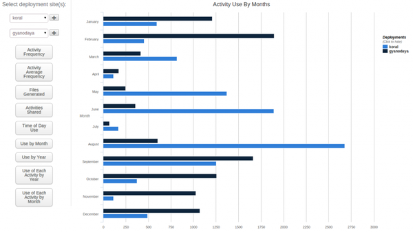
Another useful feature we have implemented recently is the possibility to compare data from multiple school deployments in a single chart. In the Use of each Activity by Month chart, for example, one can compare and contrast the usage of various activities during 2013 from two or three different schools.
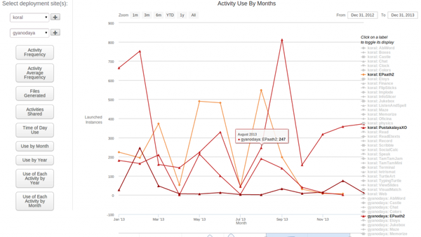
In the Use by Month chart, we have found that while the Koral deployment uses activities more in March, May, June, July, and August, Gyanodaya leads in January, February, April, September, October, November, and December. According to our expectations, the use of laptop activities decreases considerably during April, July, and November when children leave school for holidays.
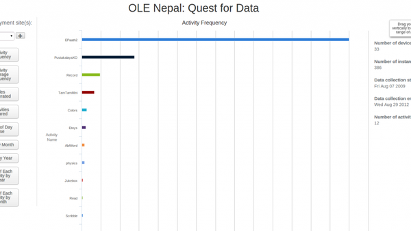
Furthermore, the most recent version of XOvis also displays some useful overall statistics from the selected deployment in the column on the right side of the chart. For each school deployment, those include the number of devices used, the number of activity instances recorded, the number of activities used, as well as the start date and end date of data collection. These statistics provide the audience some context for interpreting the chart data.
Finally, the Data Quest Team has added Activity Average Frequency spider chart, which displays the average number of activities used per device. Especially when comparing usage data from multiple deployments, we have found it more meaningful to show the average number of instances rather than the total since the number of laptops can vary from one deployment to another.
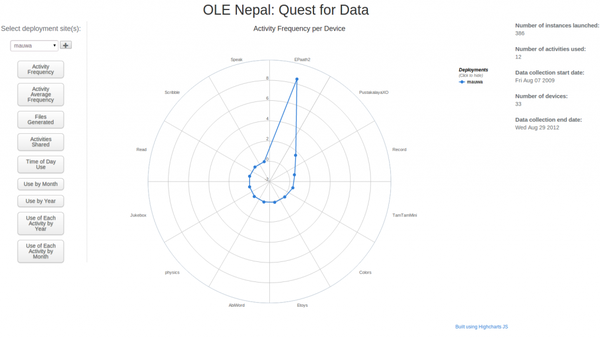
What are some the things we have learned from the charts you might ask? One of the most insightful charts is the already mentioned Use of Each Activity by Month. While we see from the Activity Frequency chart that E-Paath is by far the most frequently accessed activity at all OLE program schools, in the chart below we observe that its usage varies significantly throughout the year.
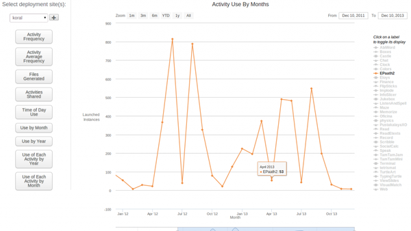
Somewhat surprisingly, we have seen that while E-Pustakalaya, digital library which comes preinstalled on OLE’s schoolservers, is the second most popular activity in some deployments such as Koral, it is superseded by some Sugar activities in others. In Kumdi, for example, both Record and TamTamMini turn out to be more popular than the library activity. In Gyanodaya, it is Typing Turtle that enjoys more screentime.
As our support visit teams keep bringing more data from additional schools, the analysis becomes progressively more comprehensive and we are going to see more usage patterns emerge from the charts. The Data Quest Team behind XOvis has already connected with XO deployments in other countries, which have been using the application to analyze their data. We are very curious about what use patterns others will uncover in their programs and how those compare with those we have seen in Nepal. To learn more about how XOvis integrates with other software projects, take a look at a recent post XOvis: The quest continues by Sameer Verma about the “Quest for Data” project.
They write essays from scratch, rewrite every sentence, and cite it using the most appropriate citation style. Therefore, don’t look around when you want a professionally crafted essay delivered on time – come to us for assistance!